Display Option-Don’t Show Resources in View Panel
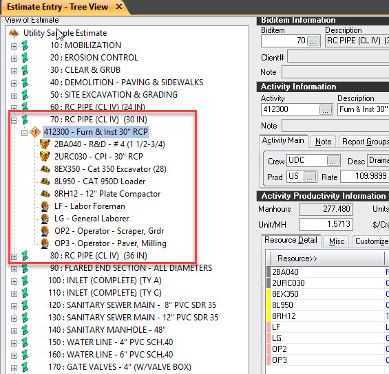
New users have a tendency click on every drill down “+” symbol they see. In the Tree View on the view side you have the option (user preference) to now allow resources to be displayed in the view side of the screen. Here is the issue. New users tend to keep opening up to see resources (because they can) when the same information already appear in the resource panel of the screen (lower right). See below. Before they know it they are scrolling more than necessary on the View side to get to their bid items because so much screen area is devoted to showing the resources. Very inefficient and confusing to a new user.

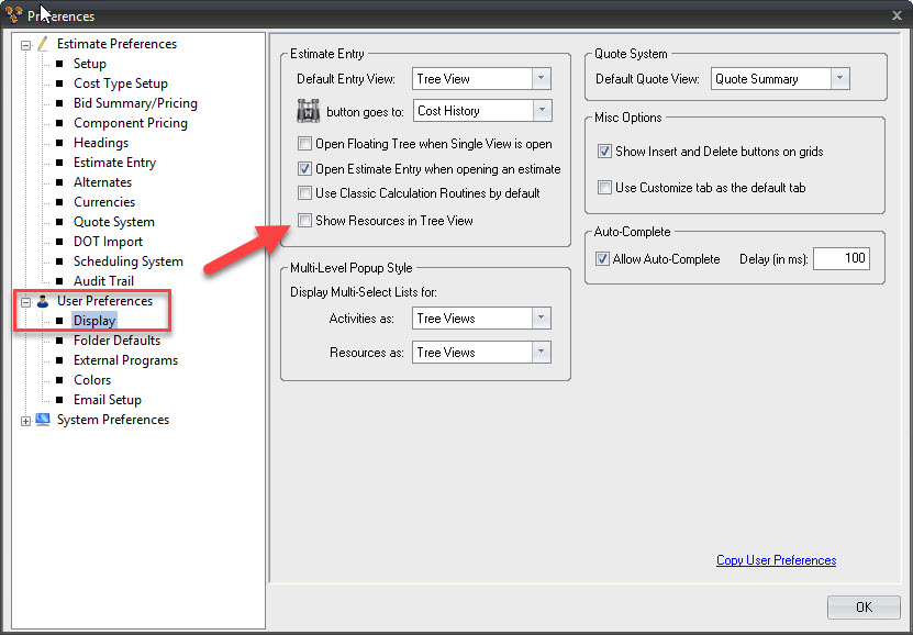
So there is a setting to not allow the user to open up the activities on the view panel. Go to Tool>Preferences. Uncheck the option “Show Resources in Tree View”

Now as the user gains experience and understand that they don’t have to click on every “+” then the option can be checked again because sometimes, especially when copying, a user does want to open up the activity on the View side but they understand that they want to minimize it upon inspection. So I recommend for new users to uncheck the option and avoid frustration on both the user and the trainer.


